Solo project · Stockholm, Sweden · 2022
Simplifying the ATM User Experience
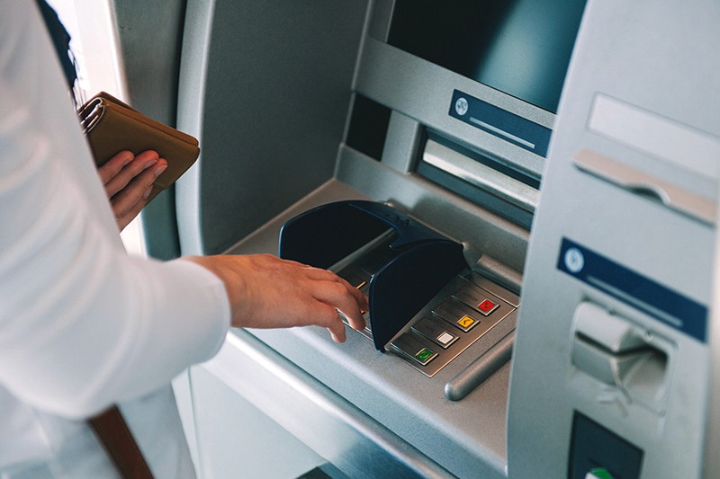
TL;DR Version:
context
January 2022. I had recently moved to Stockholm for my MSc at KTH. I was handed a hiring challenge with one prompt and a 24-hour window: redesign the ATM experience. The constraint was the point; no research budget, no user testing, no team. Just a real problem and a structured design process applied under pressure.
24 Hours
January 2022
Solo
No research budget · No user testing
Phase 1 — Understanding the existing experience
I started where the problem actually lived: at a local ATM in Stockholm. Going through the withdrawal process as a first-time user in an unfamiliar language environment surfaced three immediate problems.
Transaction time
Excessive steps between card insertion and cash. Each screen required reading, selecting, and confirming before the next appeared.
Language barriers
ATMs defaulted to Swedish. Language selection was the first step before accessing any functionality; adding friction at the most critical moment.
Timeout risk
The system timed out between steps. For a user unfamiliar with the interface or operating in a second language, the window was too short; leading to failed transactions and restarts.
Real-time recording of the existing cash withdrawal flow at a Stockholm ATM; capturing transaction time, language selection friction, and timeout risk firsthand.
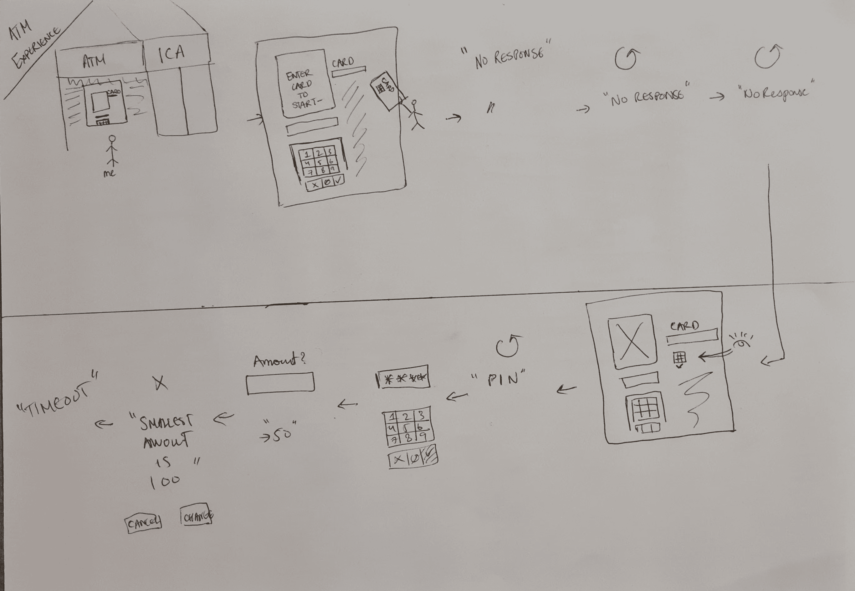
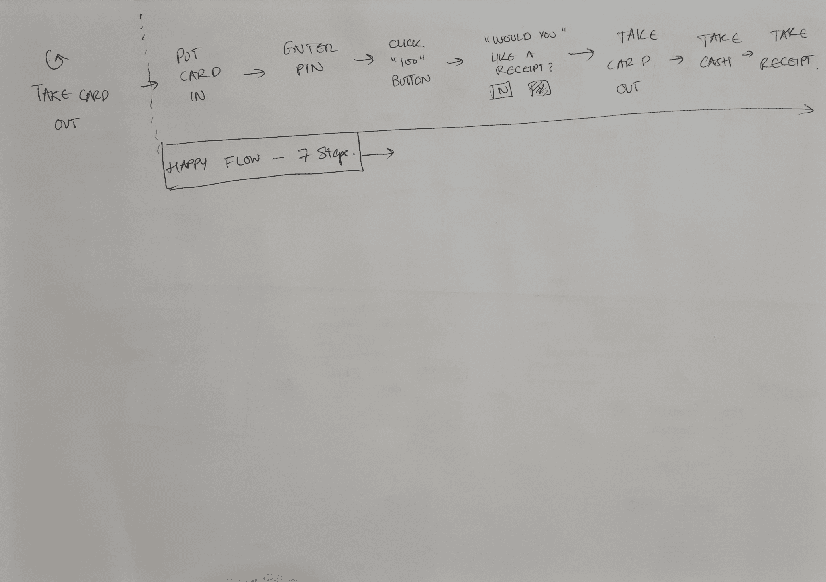
Existing ATM cash withdrawal flow mapped step by step; highlighting redundancies, friction points, and timeout risks
Phase 2 — Heuristic evaluation and brainstorming
I ran a heuristic evaluation against Nielsen's 10 usability principles; identifying the most significant violations in the current ATM interface. Then explored analogous solutions; specifically how mobile banking had solved authentication and account access. The insight: QR codes had already eliminated card-swipe in transit and payment contexts. Could the same logic apply to ATMs?
Visibility of system status
No progress indicator; users cannot tell how many steps remain in the withdrawal flow.
High severityUser control and freedom
No easy way to cancel mid-flow without restarting the entire transaction from card insertion.
High severityError prevention
Session timeout occurs silently; no sufficient warning before the transaction expires and resets.
High severityMatch between system and real world
Banking terminology on screen does not always match how users think about their money.
Medium severityFlexibility and efficiency of use
No shortcuts for frequent tasks; every user follows the same multi-step path regardless of experience.
Medium severityAesthetic and minimalist design
Screens contain irrelevant options and promotional content competing with the primary task.
Low severitySix usability violations identified across Nielsen's principles; visibility, timeout risk, and error prevention as the highest-impact issues.
Biometric authentication
Fingerprint or face ID replaces card and PIN. High security but requires hardware upgrade.
NFC tap-to-withdraw
Phone taps ATM to trigger withdrawal. Still requires app setup; limited to NFC-enabled ATMs.
QR code withdrawal
Configure transaction in app, generate QR code, scan at ATM. No card, no PIN, no language navigation.
SMS one-time code
Bank sends OTP to phone; user enters at ATM. Still requires multiple manual steps at the machine.
Redesign UI only
Simplify screens, add progress bar, fix timeout. Improves experience but does not reduce step count.
Voice-guided flow
Audio prompts guide users through each step. Helps accessibility but does not reduce friction fundamentally.
Key insight
QR codes had already eliminated card-swipe in transit and payment contexts. The same authentication logic could apply to ATMs; moving complexity off the machine and onto the device users already trust.
Six solution directions explored across mobile and hardware approaches; QR code authentication selected as the strongest candidate.
The concept: the user configures the transaction on their mobile banking app and presents a QR code at the ATM; which reads it, authenticates, and dispenses cash. No card insertion, no PIN at the machine, no language navigation.
Mobile app flow
Open banking app
Select "Withdraw Cash"
Enter amount and select account
Generate QR code (valid for 5 minutes)
Present QR code at ATM
ATM flow
Scan QR code
Confirm amount on screen
Collect cash
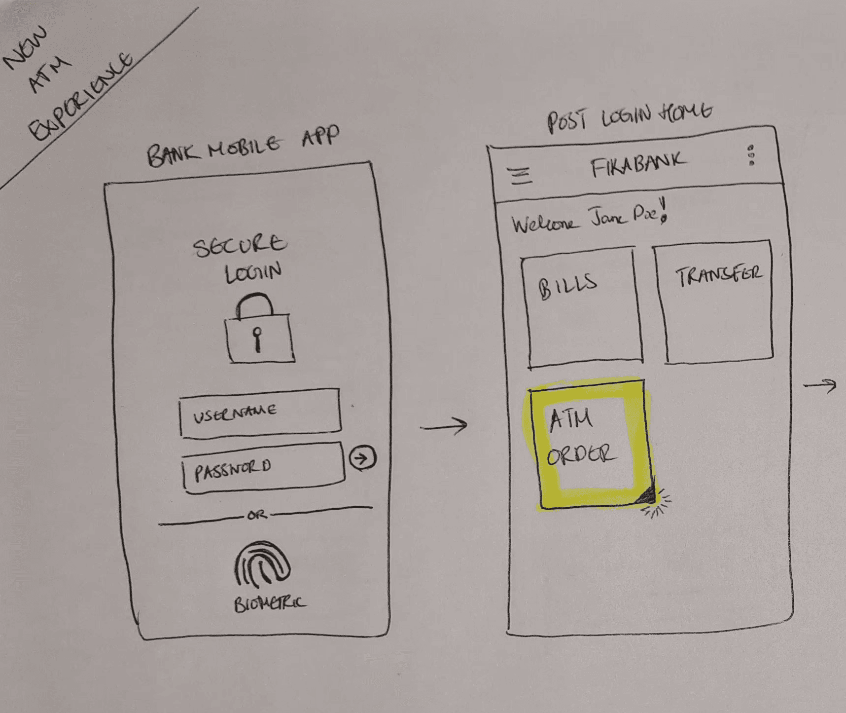
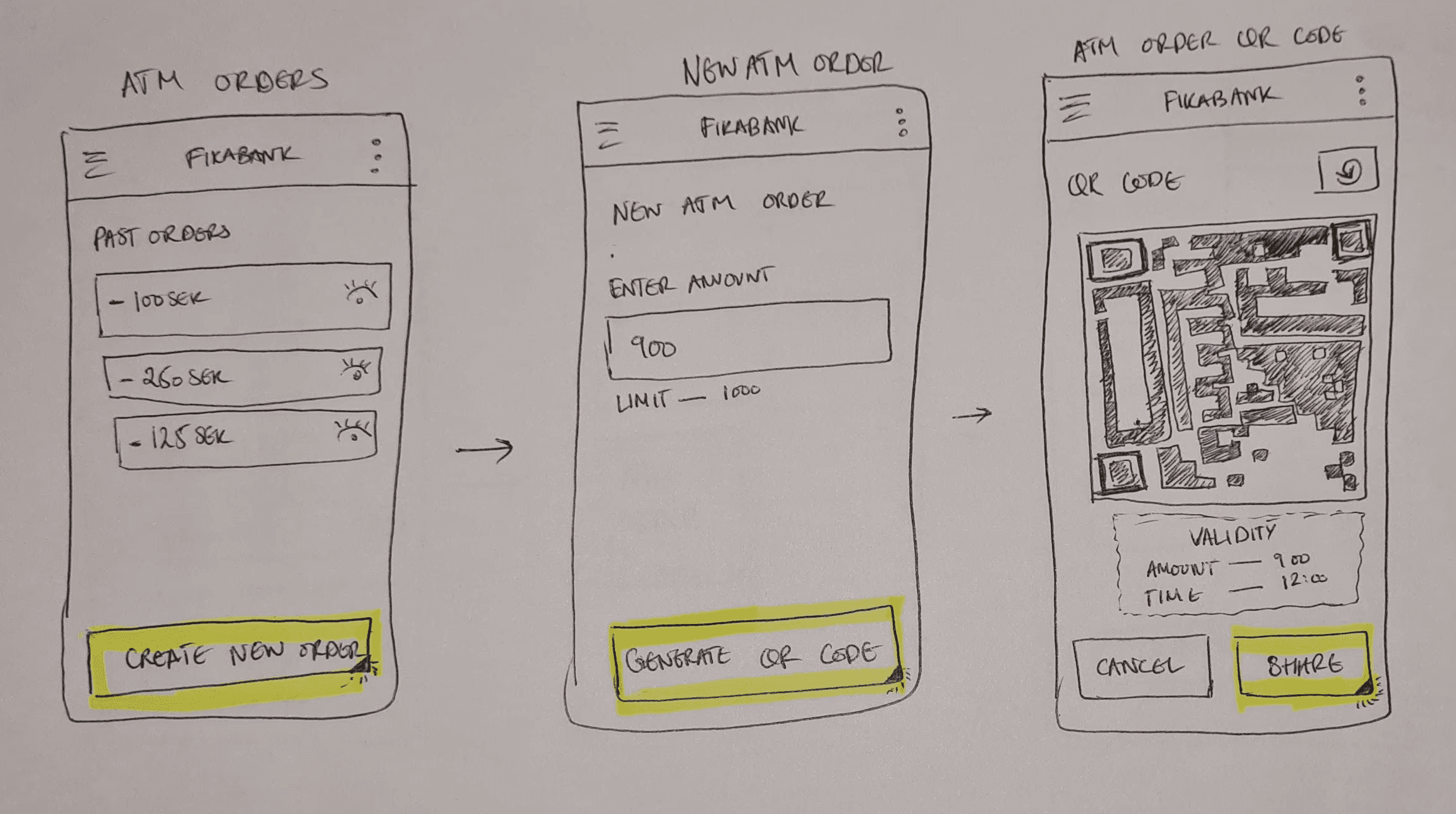
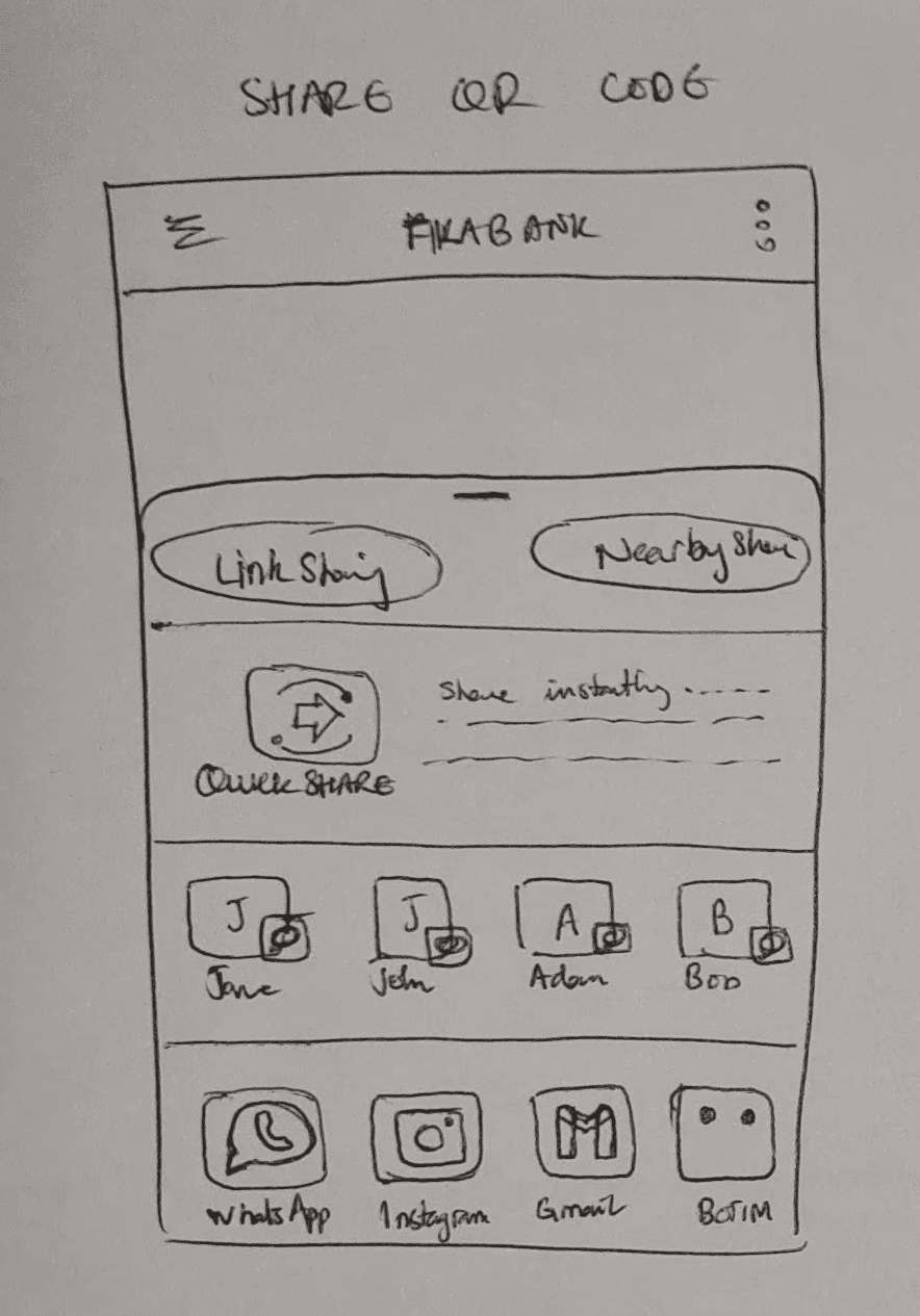
Mobile app QR code generation flow; from amount entry and account selection through to the timed code ready to scan.
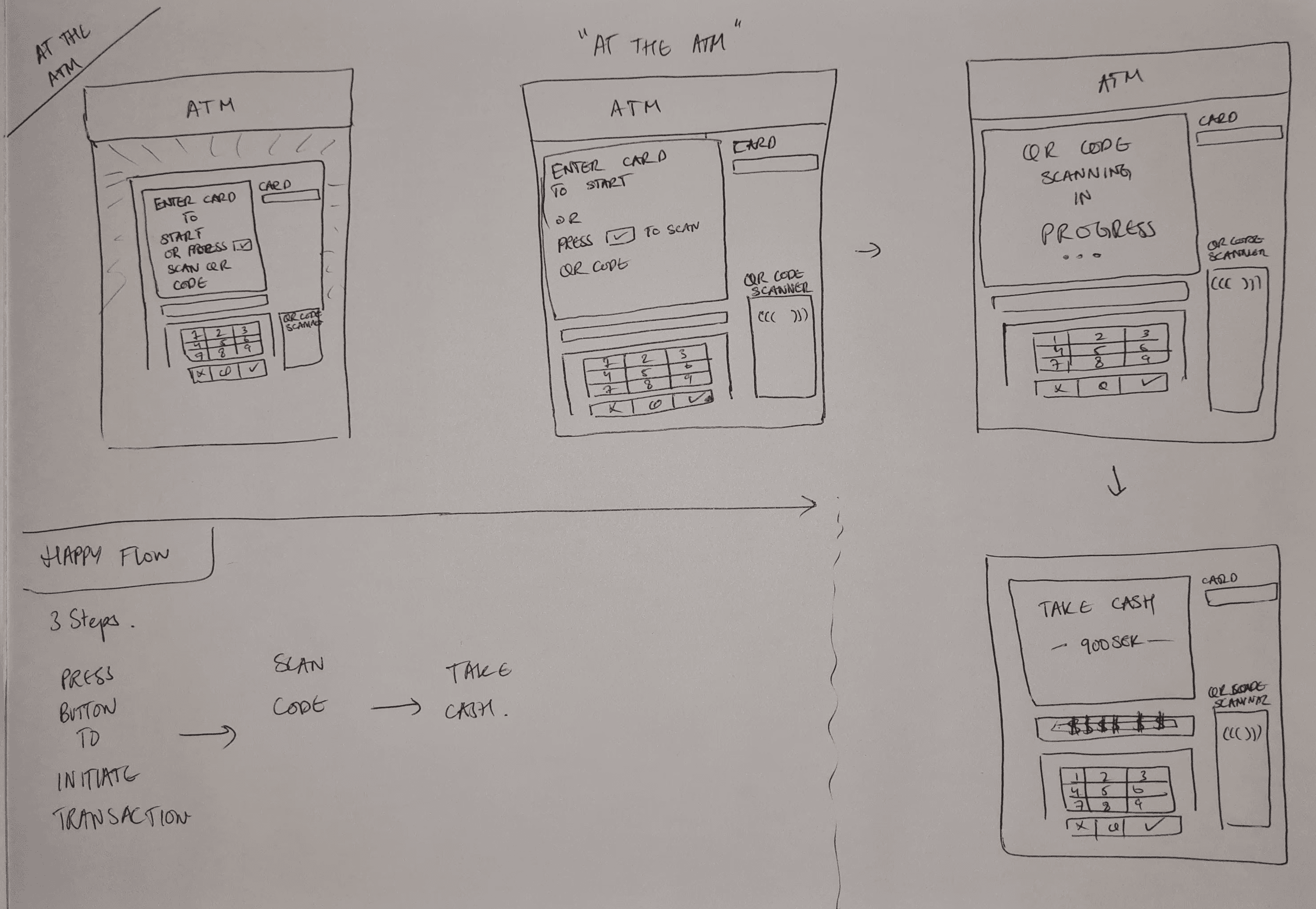
ATM Interface; QR scan replacing card insertion; confirmation screen replacing multi-step PIN navigation
Phase 4 — Domain expert review
I reviewed the concept with a banking infrastructure expert to pressure-test feasibility and security. Key findings: QR scanner hardware cost was feasible given cost trajectories and fraud savings; the 5-minute single-use token structure was consistent with mobile payment security standards; and no new network infrastructure dependency was introduced beyond what card transactions already require.
limitations and what i'd to differently
Twenty-four hours is not enough time for user research. The storyboard and heuristic evaluation captured observable friction but did not surface latent needs; particularly around digital literacy, accessibility for older users, and trust barriers around card-free transactions.
The delegation feature was not stress-tested. Edge cases around fraud, revocation, and partial withdrawals were not resolved in the prototype. A more rigorous technical review involving security, compliance, and infrastructure teams would be the right next step.
The outcome
The challenge was not really about ATMs. It was about applying a structured design process under constraint; starting from a real experience, mapping it honestly, finding the insight that changes the frame (QR codes as authentication, not just payment), and building something credible enough to defend.
The process holds regardless of the timeline. What changes under pressure is the depth you can go; not the shape of the thinking.
role & tools
Solo UX Designer · 24-hour hiring challenge · Contextual observation · Storyboarding · Heuristic evaluation · Brainstorming · Paper prototyping · Domain expert review