CureMD · Healthcare SaaS (EHR) · 2021
Improving the Fax Experience for Clinical Teams
TL;DR Version:
the Problem
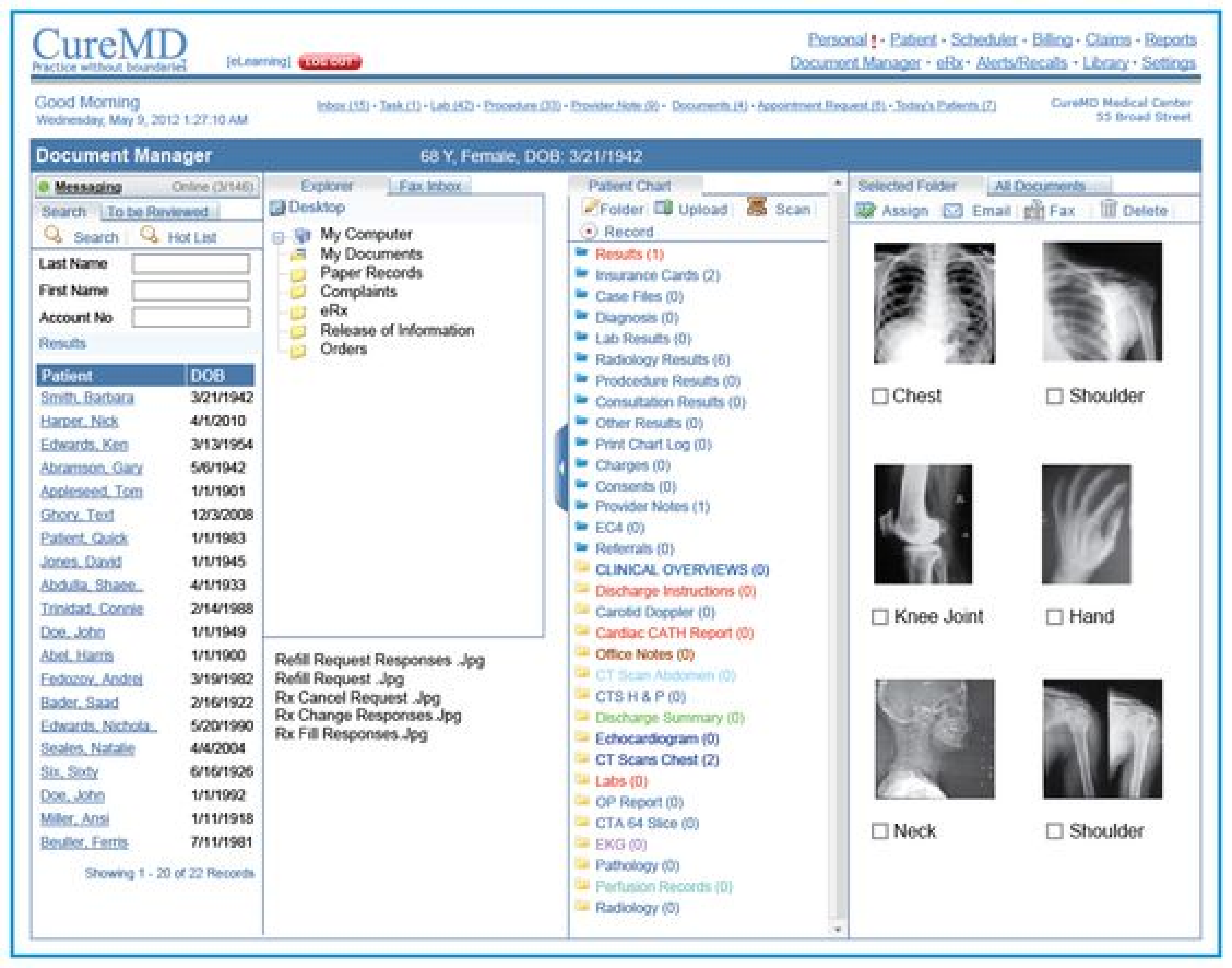
CureMD's inbound fax management system was causing daily operational pain across hundreds of clinical practices. Office staff spent significant portions of their day on a single workflow: receiving faxes, reading them manually, renaming files, locating the right patient, and dragging documents into the correct folder.
At one practice, two staff members spent over 1.5 hours every morning just renaming and sorting. Another managed 3,000+ patients; 70% in assisted living facilities; with up to 80 patients at a single facility faxing simultaneously. Two people processing the same inbox had no way of knowing which faxes had already been handled. They communicated via a texting app, one starting from the front of the inbox, the other from the back. A misplaced file had no undo; it had to be printed, deleted, and rescanned. Over 5,000 support tickets had surfaced these problems.
Phase 1 — Discovery and stakeholder buy-in
Before research could begin, the project needed management approval. I collaborated with a business analyst to review the support ticket backlog and identify the most frequent pain points. A cross-functional core team was assembled: Product Owner, Business Analyst, Client Services, Sales, Engineering, and UX. Research was segmented across four client types: enterprise clients, highest fax-volume clients, clients who had never used the fax service, and clients who had quit the service.
The UX Value Proposition framed the project around two business objectives: boosting conversion of enterprise-level prospects and increasing adoption among clients not using the fax service. Current state was rated Poor across workflow efficiency, system credibility, interface desirability, and accessibility; with a clear target of Excellent.
UX Value Proposition
Current — Poor
Workflow efficiency
System credibility
Interface desirability
Accessibility
Navigation clarity
Error recovery
Target — Excellent
Efficient goal-oriented flows
Trusted, credible system
Desirable UI
Inclusive design
Easy navigation
Undo and error tolerance
Design objectives
Current state vs desired future state chart
UX KPI Framework
01
Task Success Rate
Correctly completed tasks out of total attempts.
02
Time on Task
Time to complete each task. Shorter = higher efficiency.
03
User Error Rate
Wrong entries per task. Measures usability and clarity.
04
Search vs Navigation
Less search usage indicates better navigation design.
Tasks measured
KPIs defined for post-release Mixpanel measurement
Phase 2 — Competitor Analysis
Before talking to users, I benchmarked how competitor EHR platforms handled digital fax; looking at workflow structure, multi-user support, folder management, and AI/OCR integration across six platforms: Concord (Allscripts), etherFAX (Cerner), OpenText Intelligent Capture (Epic), ReferralMD, AthenaHealth, and DrChrono.
The most advanced implementation used ML to automatically route inbound faxes to defined folders based on document title; with manual review as a fallback. Most vendors, including CureMD, were operating at the lowest level of digital fax maturity: receiving files but doing nothing intelligent with them. This analysis shaped the Phase 1 requirements and a longer-term OCR phase roadmap.
Phase 3 — User Research
Seven participants across four clinical practices; medical assistants, patient clinical navigators, and office managers; were interviewed using a structured script, with sessions recorded for analysis. Seven key insights emerged:
Renaming is a daily burden.
Files arrive named with meaningless number strings. At one practice this task alone consumed 1.5 hours each morning.
No multi-user awareness.
No read/unread states, no locking mechanism. Practices improvised with texting apps and verbal check-ins. The most universally requested capability.
Browsing is manual and slow.
No integrated viewer, no auto-populated metadata. Users had to open, read, navigate back, then act; switching context repeatedly.
The folder structure is overwhelming.
One long undifferentiated list with no undo on misplaced files. A wrong drop meant printing, deleting, and rescanning.
Log behaviour is inconsistent.
Not designed around actual user needs; leading to missed failed faxes and inconsistent audit trails.
Sorting is unintuitive.
Limited options, hard to discover, no folder-level controls. Users developed individual workarounds.
Users wanted specific features.
Bulk selection, folder search, integrated PDF viewer, patient DOB search, and automated assignment all surfaced across multiple participants.
"It's too long to look at and this has been a problem since we went live with CureMD in 2019."
Carol, Office Manager, 5+ years on the system
Phase 4 — Personas and User Flows
Research was synthesised into three personas spanning new, experienced, and managerial user archetypes; each grounded in direct user quotes.
Mapping the existing user flows revealed four distinct paths users took to complete the same core task; a finding in itself. The inconsistency was not just a usability problem; it was structural.
Current — fragmented
Current User Flow
Proposed — unified
Proposed User Flow
Phase 5 — Paper Prototyping
Paper prototypes were built iteratively to test structural decisions before moving to high fidelity. The core decision: collapse the fragmented multi-screen workflow into a two-step process. Open and act; rather than open, navigate, close, navigate, act.
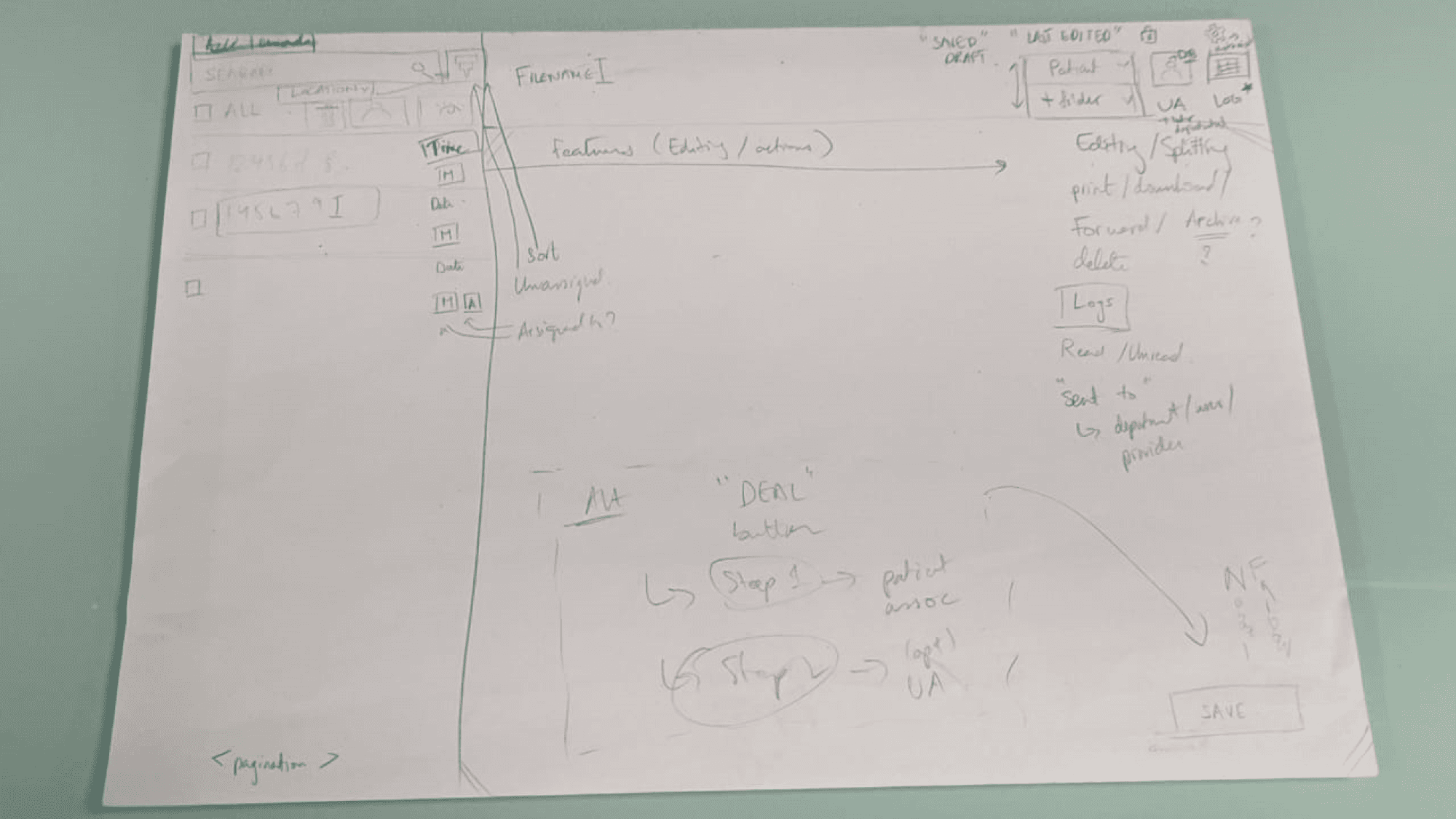
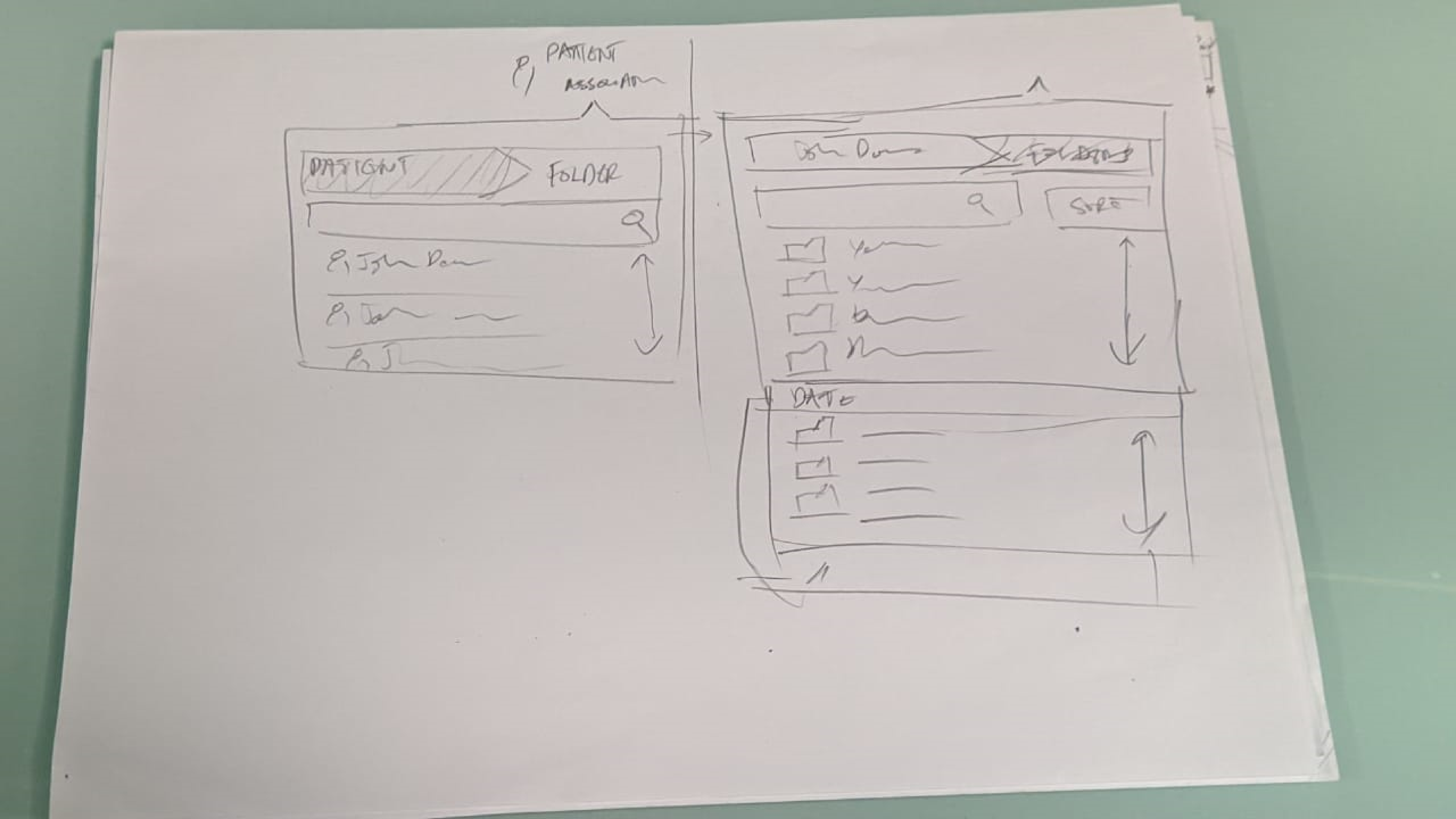
Paper Prototying - Early sketches testing inbox layout, filing flow, and feature scope
Unified inbox with read/unread states and locking
Multiple users could work the same inbox simultaneously without collision or texting-app workarounds.
Integrated PDF viewer with contextual actions
Rename, assign, and file without leaving the viewing context — eliminating the back-and-forth navigation loop.
Streamlined folder structure
Filtered to relevant folders per permission, with search, segmentation by division, and an undo mechanism for misplaced files.
Improved sorting
Visible, accessible controls at both list and folder level, with alphabetical auto-sort on rename.
Bulk selection and actions
Handle multiple faxes to the same patient or provider in a single action rather than repeating the full workflow per file.
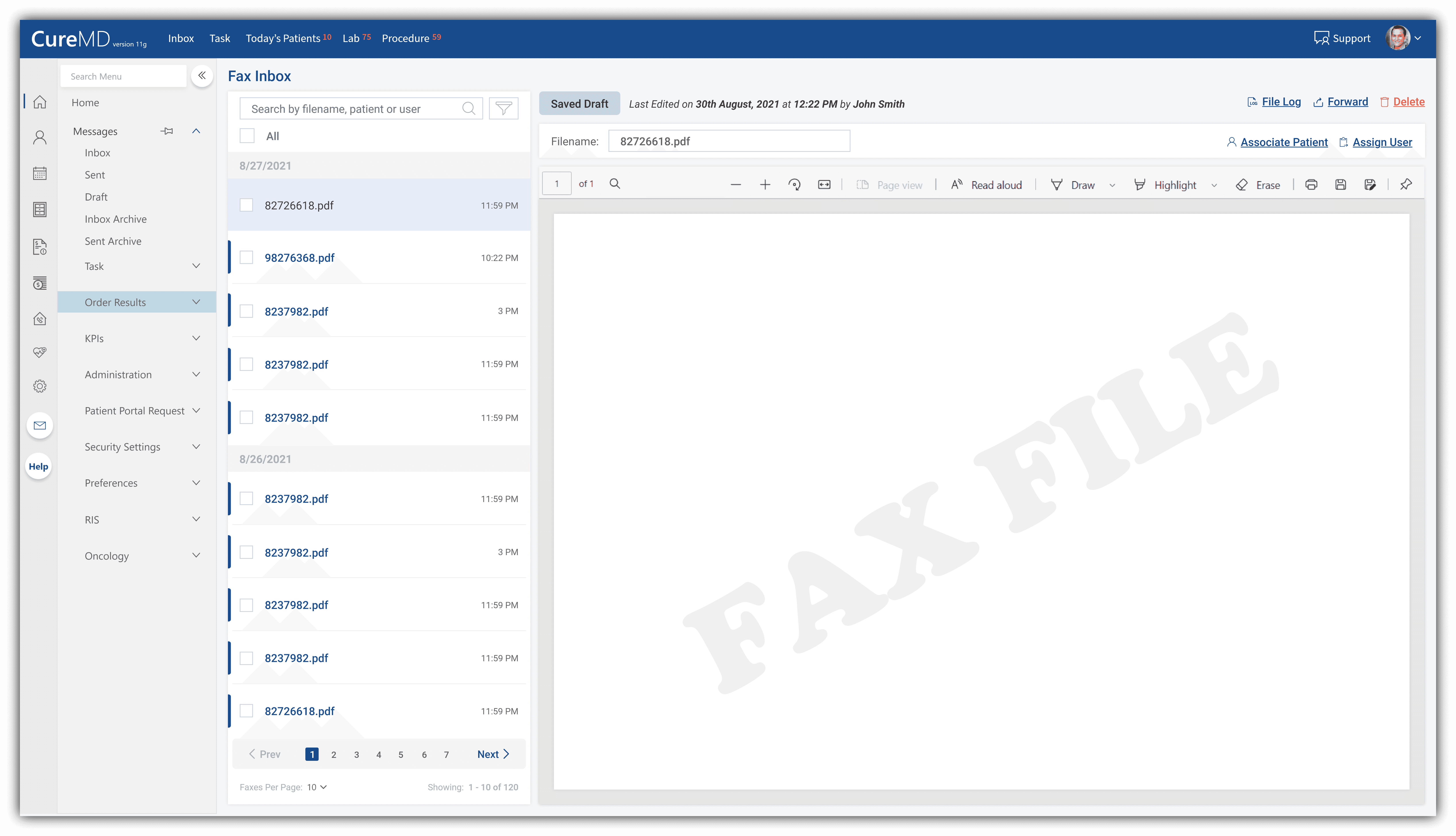
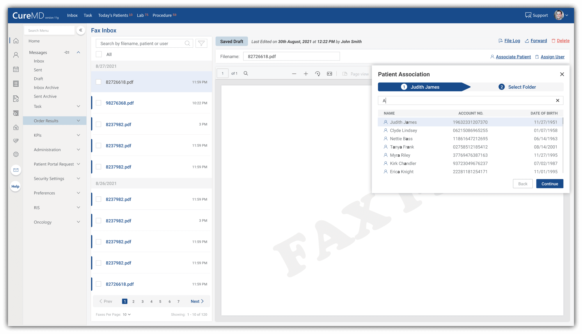
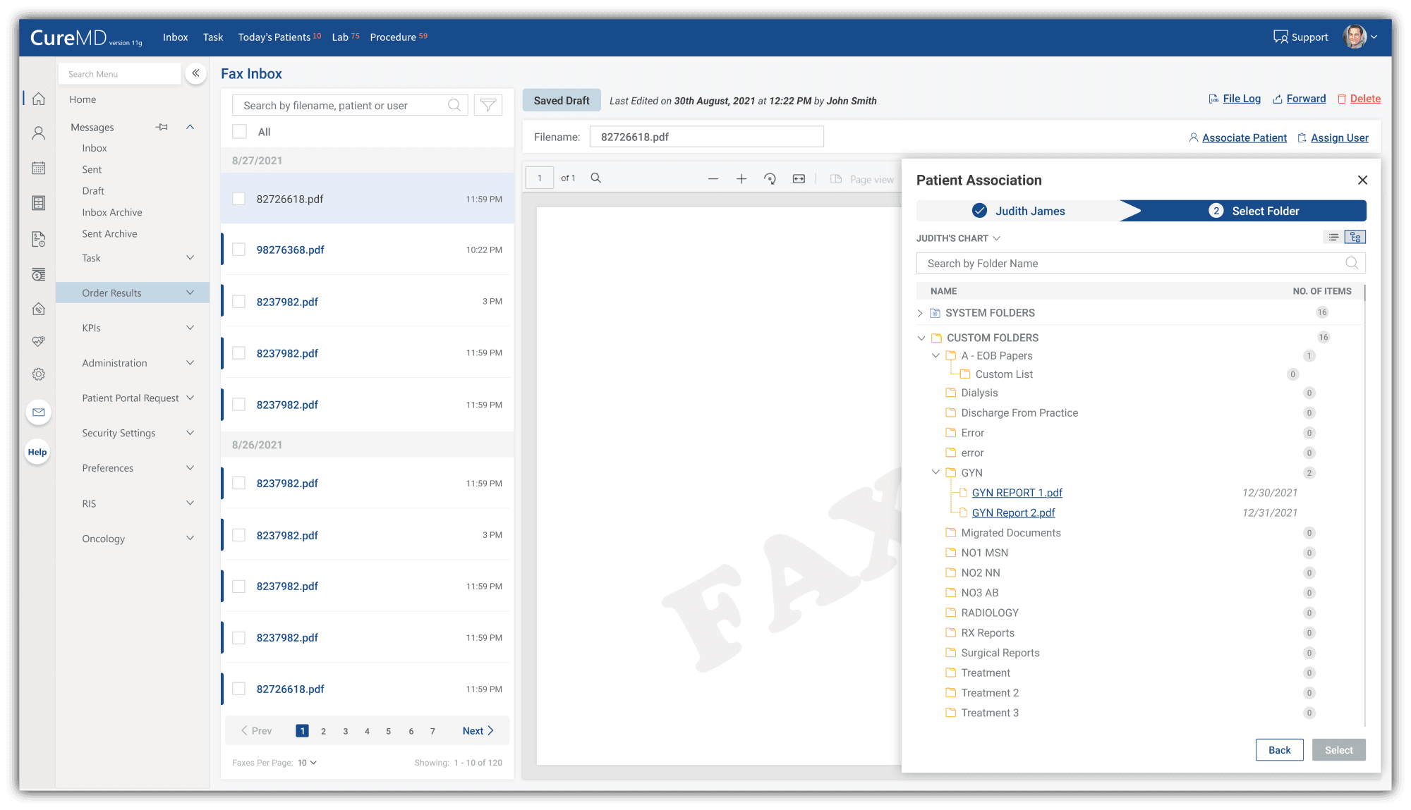
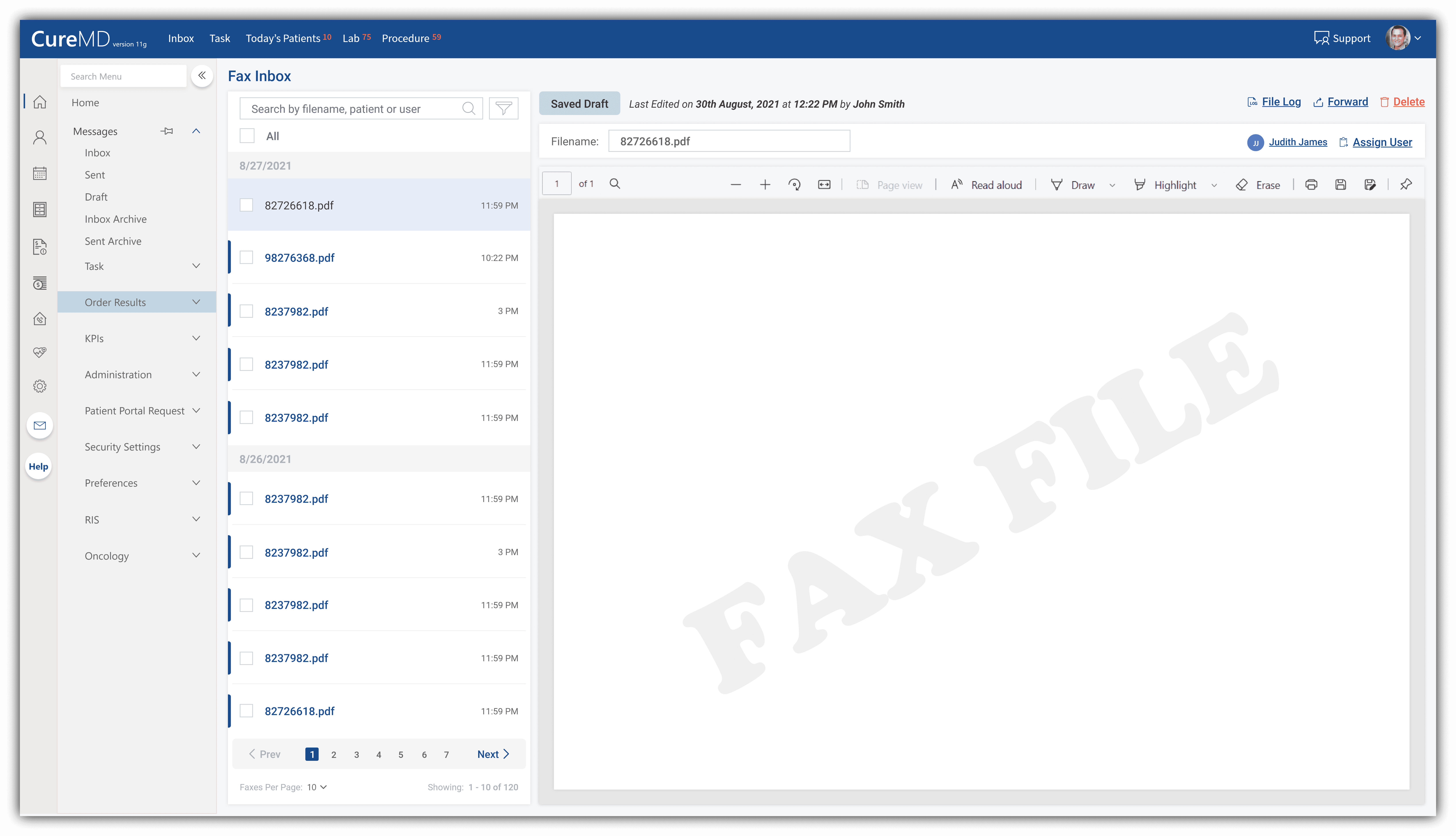
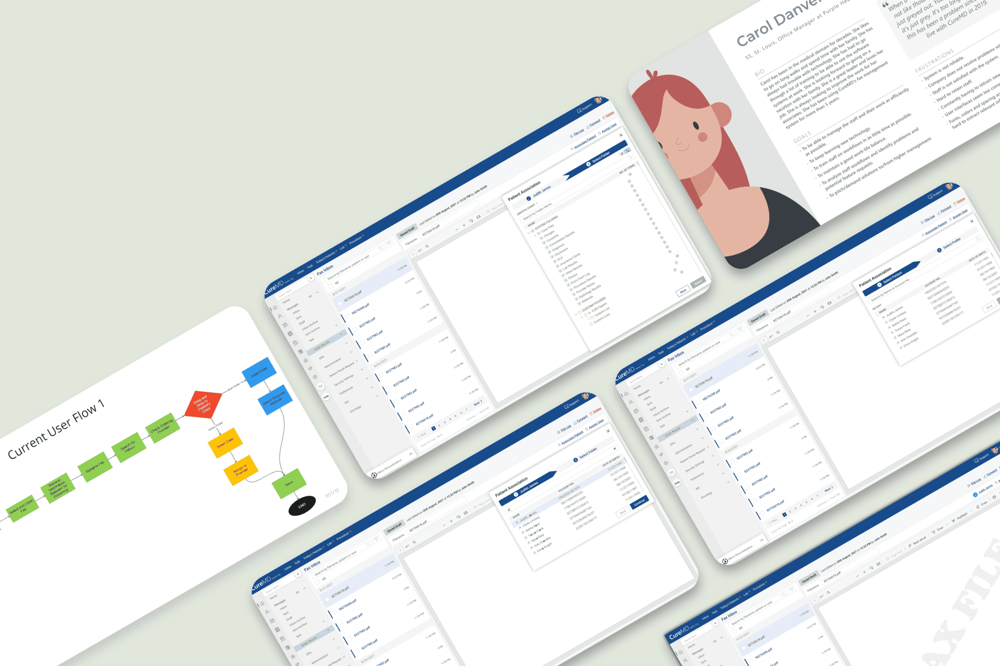
Redesigned fax management interface - inbox, document viewer, folder placement, and assignment flow.
limitations and what i'd to differently
Formal usability testing was not completed before handoff — validated through internal and stakeholder feedback only. A moderated study with even three or four participants would have surfaced edge cases earlier. I'd also push for a phased release starting with multi-user support and the integrated viewer. I transitioned to a double master's programme at TU Berlin and KTH at the point of handoff, leaving implementation with the product team alongside full documentation, defined KPIs, and stakeholder sign-off.
The outcome
The redesign gave every daily workaround a designed alternative. The 1.5-hour morning renaming session, the texting-app coordination, the print-delete-rescan folder correction, all had a solution in the proposed system.
More quietly, this project validated something harder to see in the final screens: that a structured UX process; competitive analysis, structured research, synthesis, personas, flows, prototyping, KPI definition, could be applied within the constraints of a resource-limited product environment and produce something worth building. For a practice that didn't exist twelve months earlier, that was its own kind of outcome.
role & tools
UX Designer and Team Lead · Cross-functional team: PO, BA, CS, Sales, Dev, UX · Support ticket analysis · Competitive analysis (6 platforms) · Stakeholder workshops · User interviews (7 participants, 4 practices) · Persona development · User flow mapping · Paper prototyping · UX KPI definition